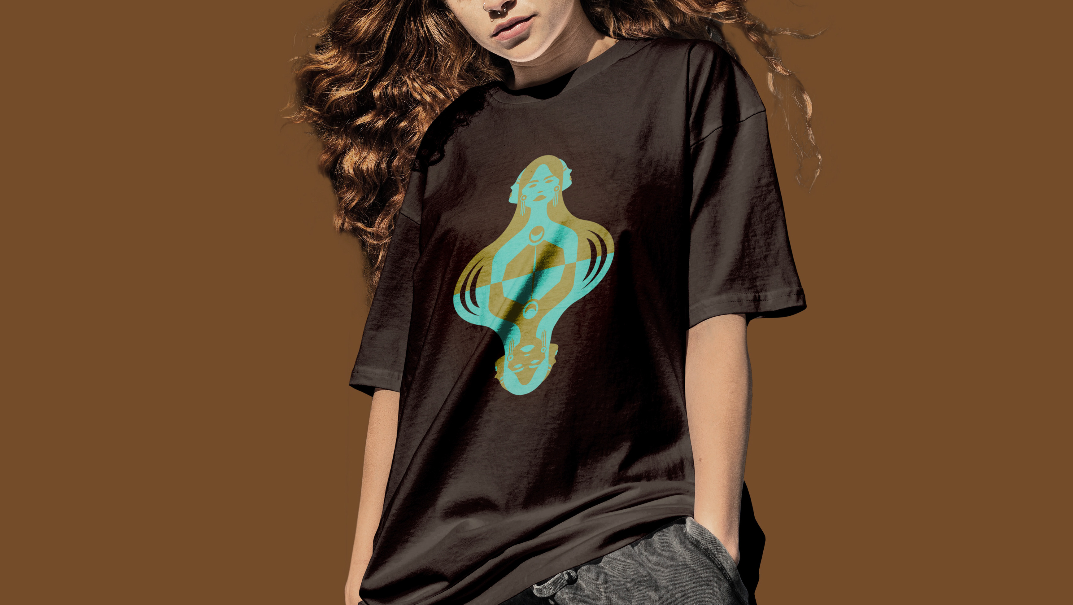
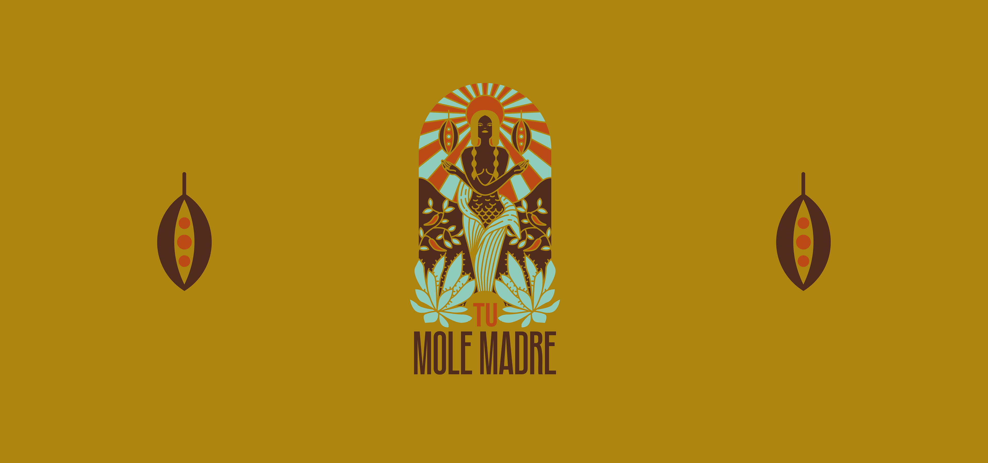
Tu Mole Madre's branding strategy centers around capturing the essence of Mexican tradition and the goddess Chicomecóatl. The logo artfully portrays the goddess, emphasizing symmetry to symbolize the importance of balance in the kitchen. The choice of a condensed typeface complements the figure, creating an optical illusion of height and elegance, reinforcing the brand's commitment to excellence in its cuisine.
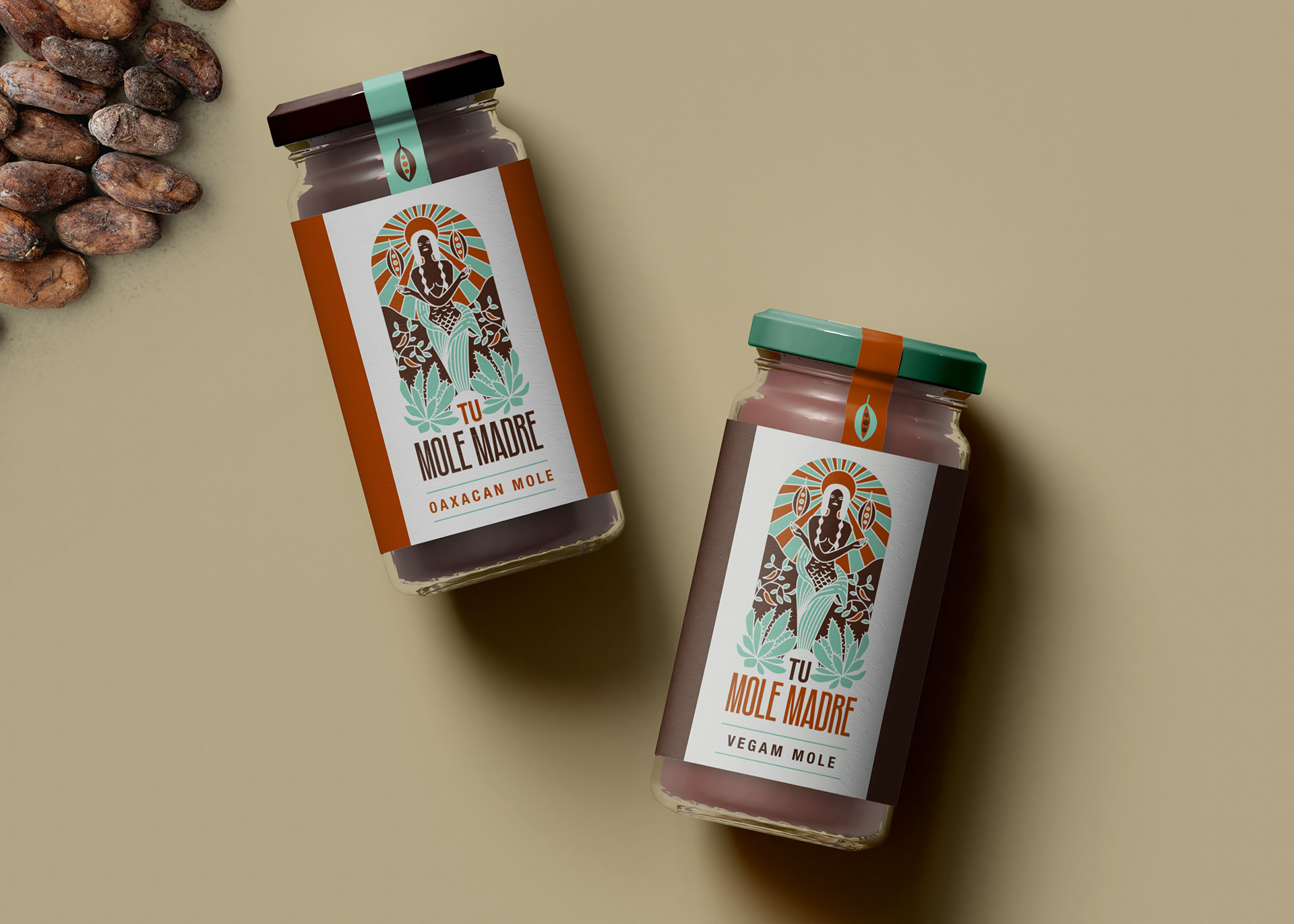
The color palette, comprising mint, brown, and clay, artfully replicates the tones found in ancient Mesoamerican codices. This contemporary effect pays homage to the rich history of the region while infusing a modern touch to the brand's visual identity.
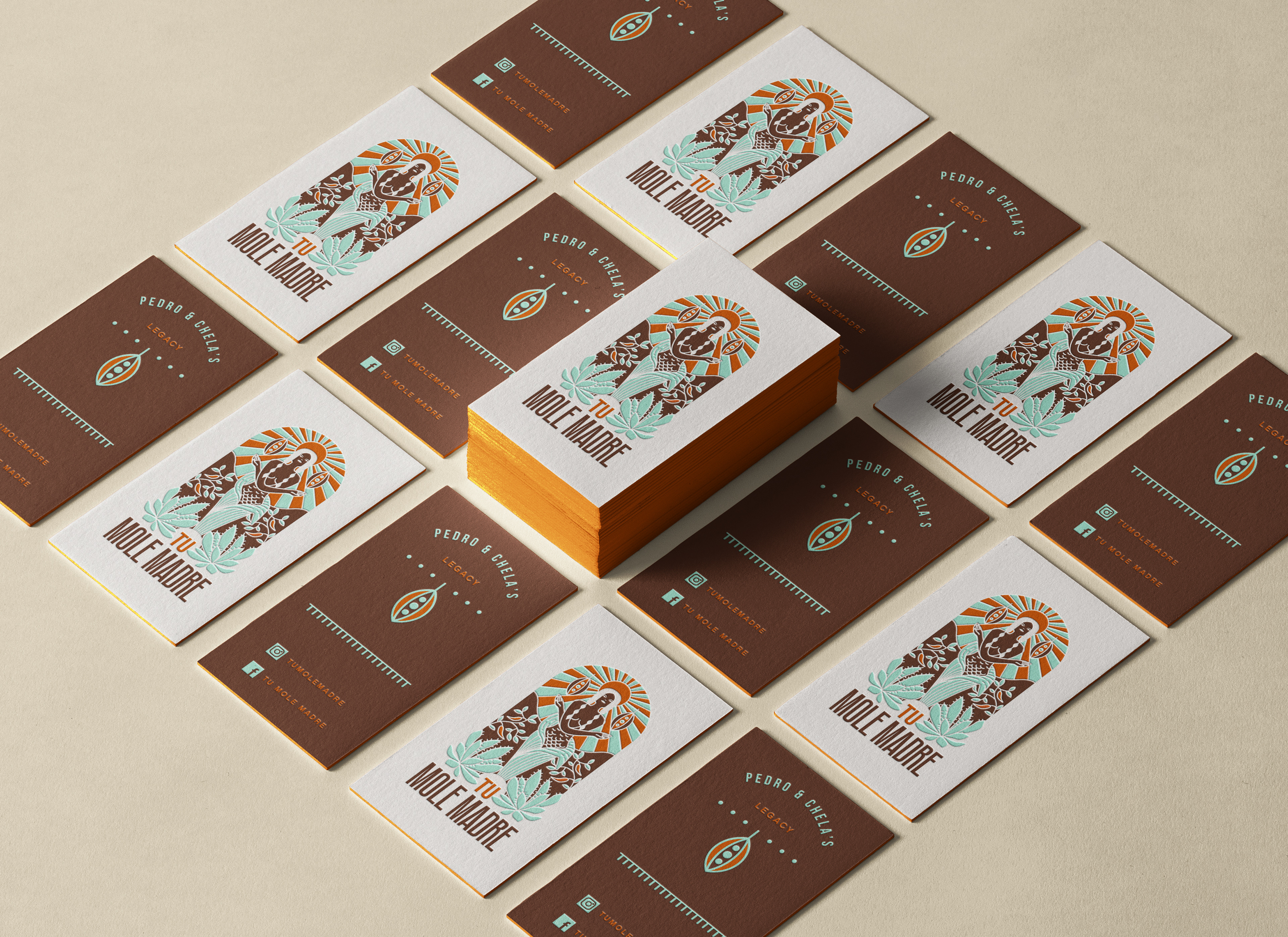
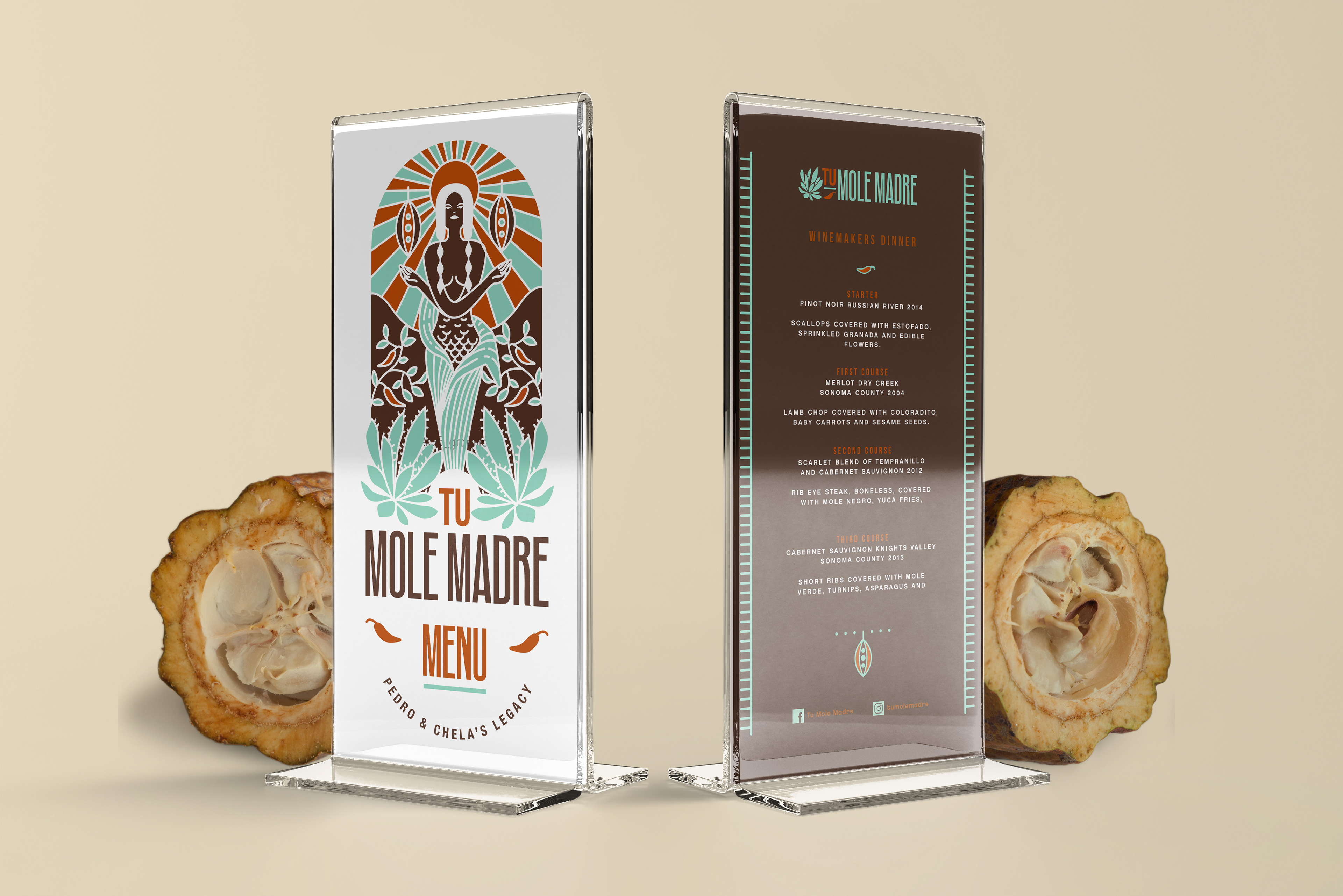
Tu Mole Madre's branding beautifully celebrates Oaxacan cuisine and Mexican culture, depicting the goddess of corn, Chicomecóatl. The balanced and symmetrical logo, combined with a contemporary color palette inspired by Mesoamerican codices, reflects culinary excellence and deep-rooted tradition. The brand's identity pays homage to its heritage while appealing to modern tastes, inviting customers to savor the flavors of Mexico's rich culinary legacy.