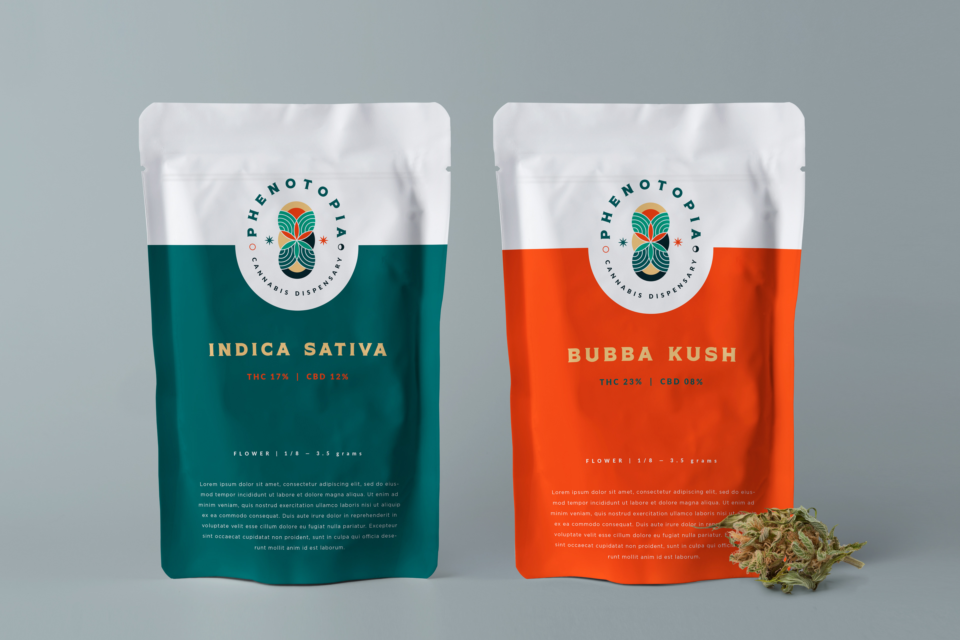
Phenotopia's branding solution was meticulously crafted to capture the essence of the 1970s, while also reflecting the dispensary's commitment to providing tailored cannabis experiences.

Inspired by the 1970s graphic style, the logo blends geometric and organic shapes, symbolizing the connection to nature. High-contrast colors – orange and aqua – evoke the era's vibrant spirit. The logo's day and night representation signifies balance and well-being, while also highlighting Phenotopia's round-the-clock accessibility.
The logo's elements go beyond aesthetics. It subtly incorporates the fair trade aspect with the weed flower, underscoring the dispensary's ethical commitment. The choice of a modern, bold font adds sophistication, with a subtle nod to Western fonts that were prominent in the 1970s.

Incorporating the essence of the 1970s counterculture, the branding aligns with the era's historical affinity for cannabis. Phenotopia's promise of a personalized cannabis journey resonates with the hippie ideology of individual exploration, offering customers a unique selection that suits their persona and the occasion.
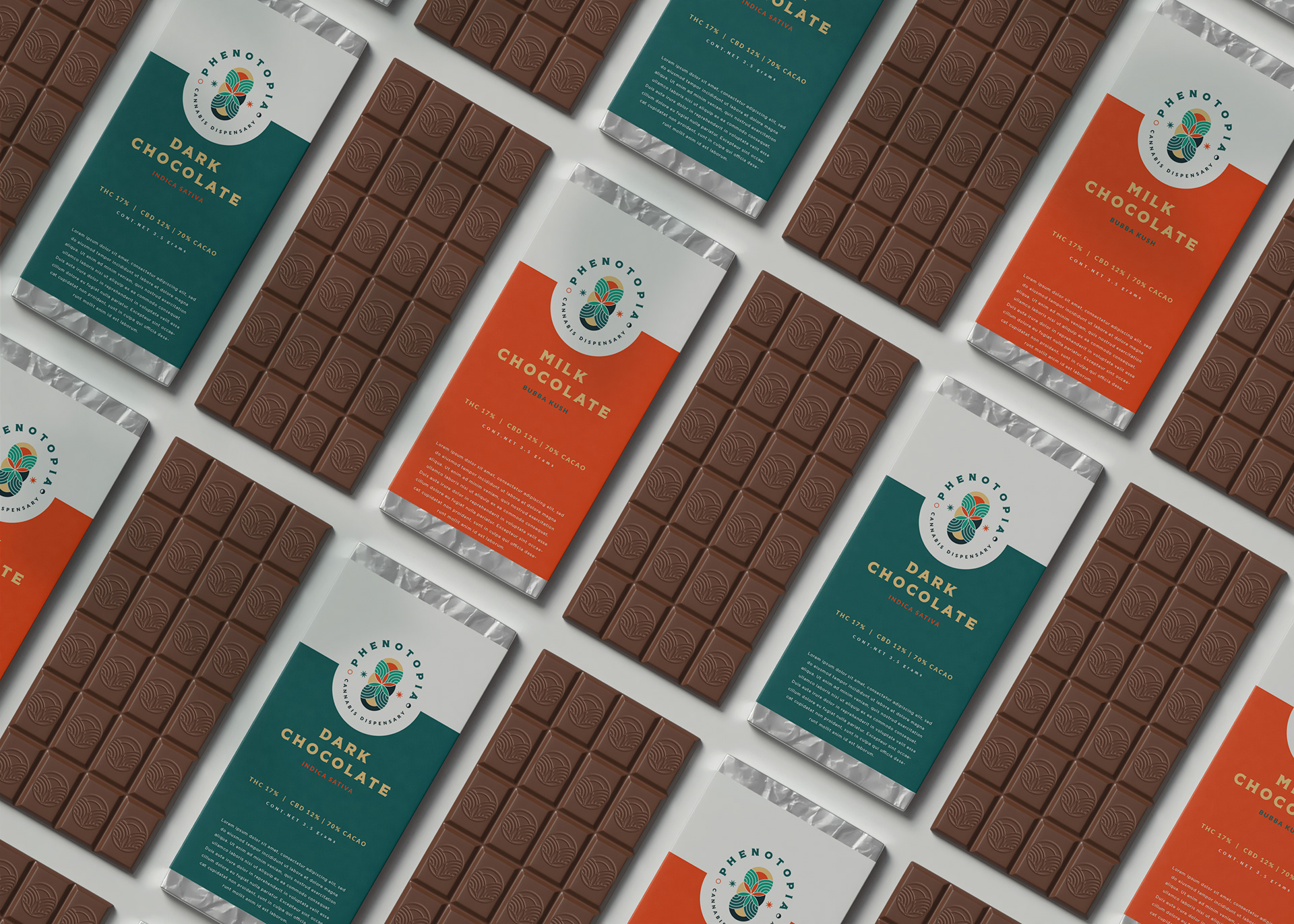
Phenotopia's brand journey elegantly merges 1970s aesthetics with contemporary cannabis culture. The logo's vibrant shapes and contrasting colors echo the era's spirit, while symbolizing balance and ethical commitment. Offering personalized cannabis experiences, the brand encapsulates the countercultural ethos of exploration and harmony. With a touch of sophistication in font choice, Phenotopia's identity becomes a captivating blend of nostalgia and modernity, beckoning both enthusiasts and newcomers to embark on a distinctive cannabis adventure.