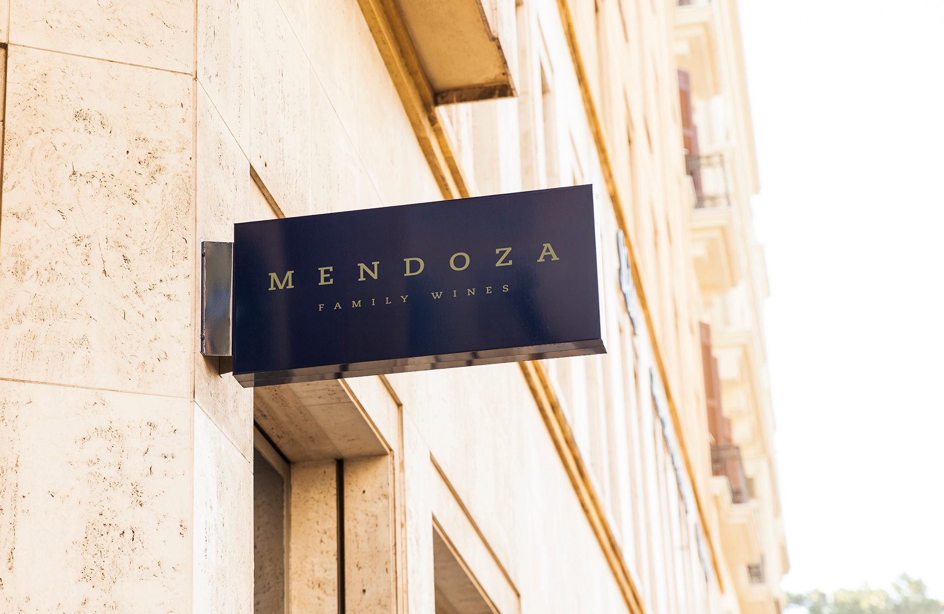
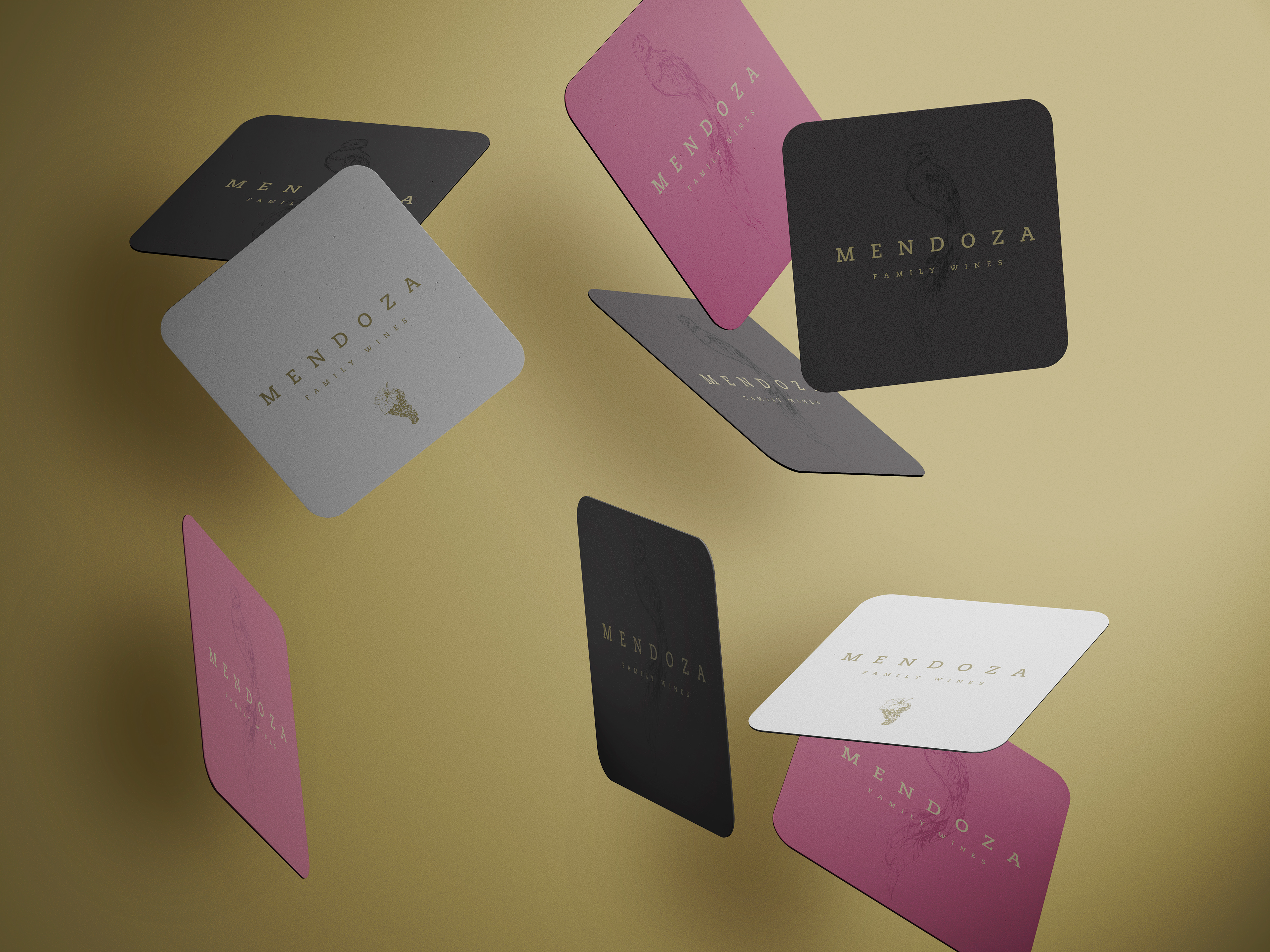
Mendoza's branding strategy revolves around representing the winery's core values of elegance, sophistication, and familial heritage. The typographic logotype, crafted with the Caecilia font, strikes a perfect balance between modern aesthetics and traditional craftsmanship. The geometric slab serif font harks back to the history of classic letterforms while infusing a contemporary touch, reflecting Mendoza's commitment to crafting exceptional wines with time-honored techniques and innovative methods.

The carefully chosen grayscale color palette symbolizes the maturity and refinement of the brand's wines, while the subtle gold tint adds a touch of luxury and sophistication. The combination creates a visual experience that resonates with wine connoisseurs, communicating the brand's dedication to producing high-quality, distinguished wines.
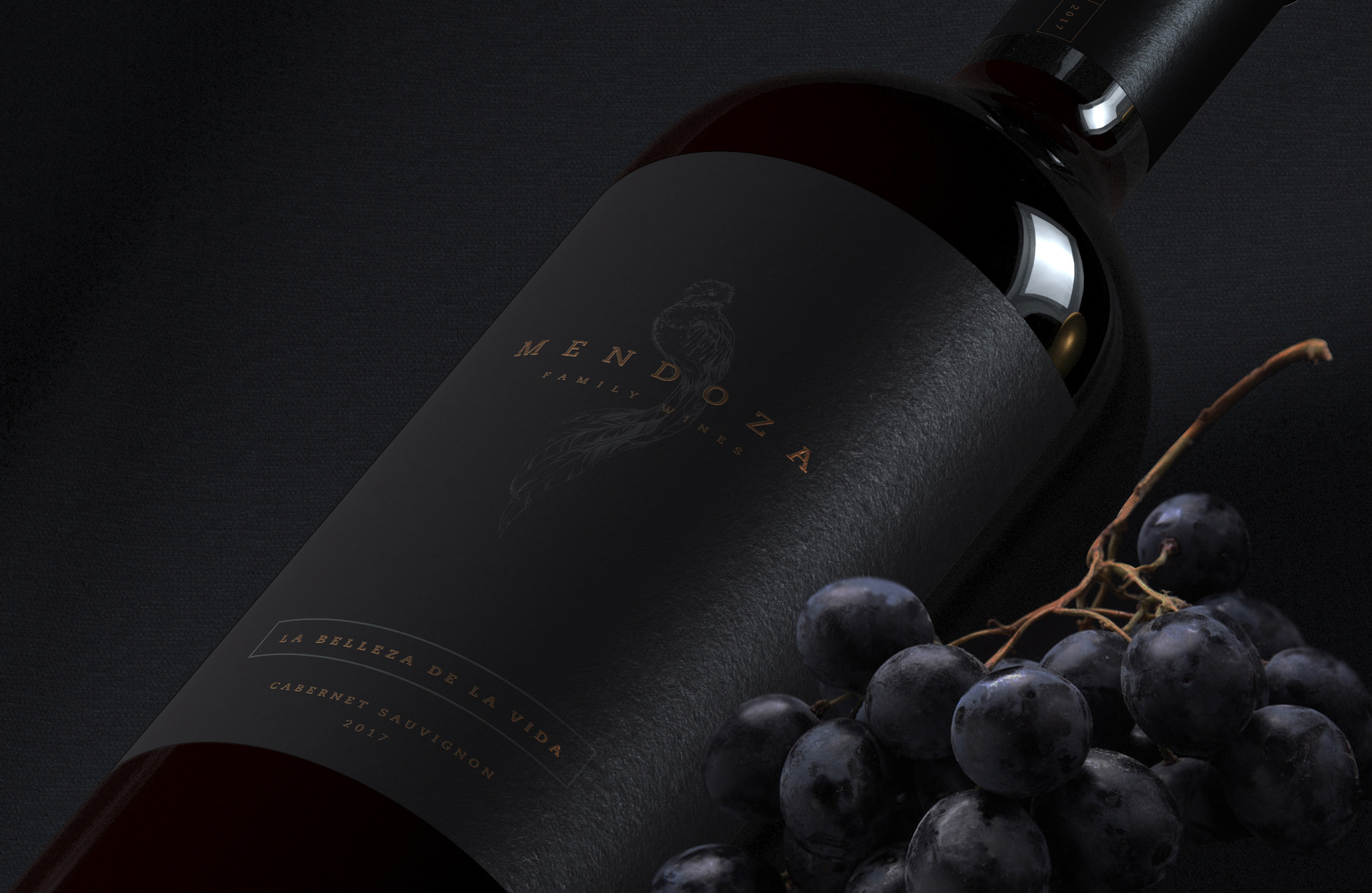
To further reinforce the brand's connection to its family origins in Guatemala, a majestic Quetzal bird is integrated as a complementary graphic element in the label design. The Quetzal represents not only a connection to heritage but also the winery's commitment to nature, highlighting its eco-friendly practices and respect for the environment.
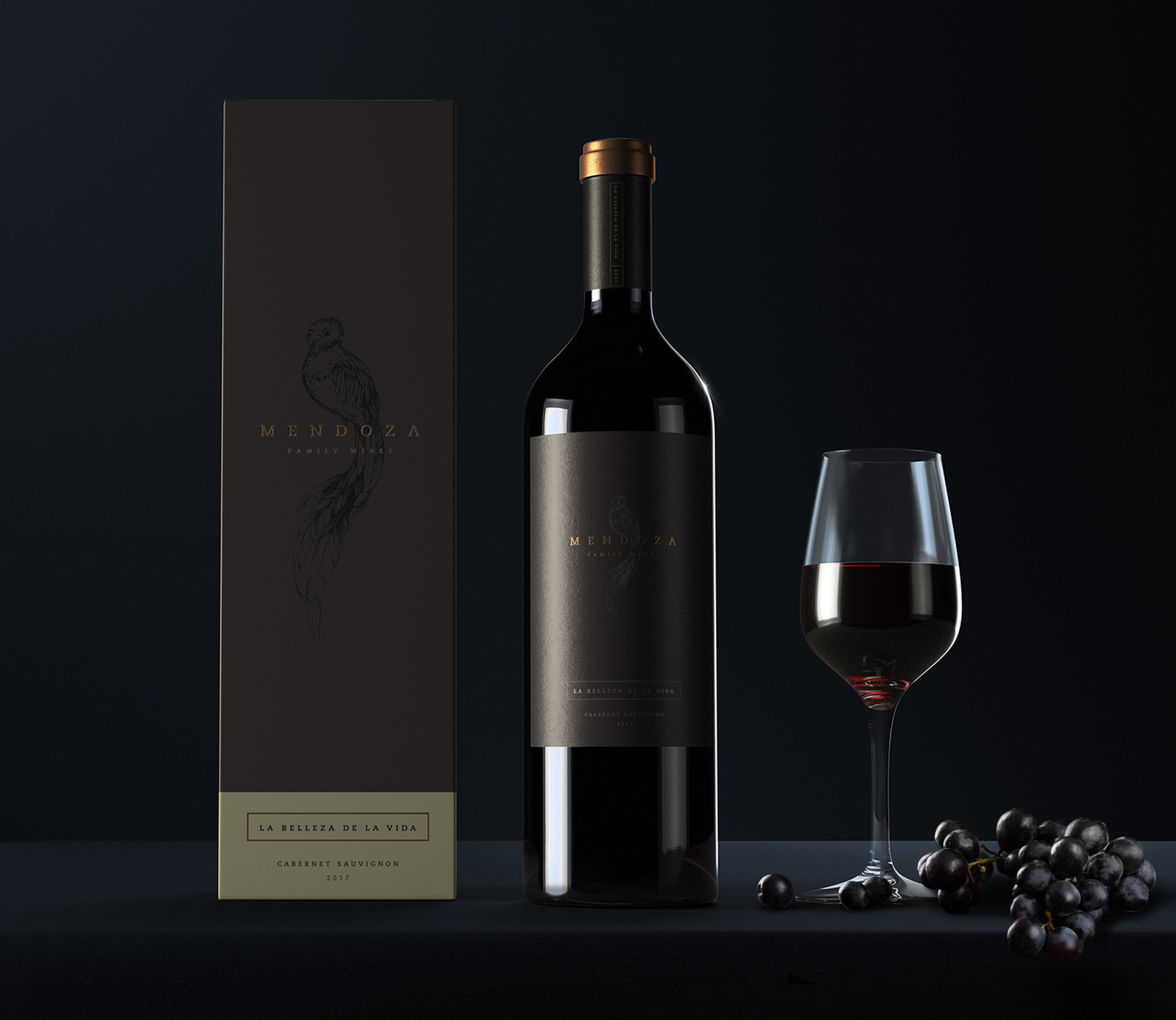
Mendoza Winery's branding exemplifies the fusion of modern elegance and heritage. Through a sophisticated typographic logotype and a calm grayscale palette with a hint of gold, the brand communicates its commitment to producing exceptional wines with a touch of luxury. The inclusion of the Quetzal bird pays homage to its Guatemalan family origins, creating a unique and memorable brand story in the competitive Napa Valley wine industry.