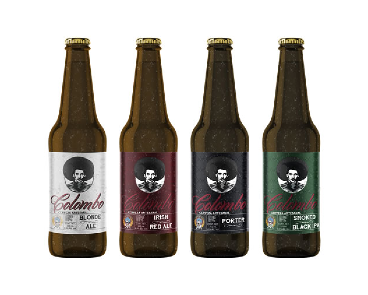
The old branding for Colombo did not effectively communicate the brand's story or resonate with a broader customer base. The label design lacked visual impact and failed to stand out on supermarket shelves. Additionally, the brand's target audience was limited to local buyers, and there was a need to attract craft beer enthusiasts who were willing to invest in the brand's products and merchandise.
To address these challenges, Colombo underwent a comprehensive rebranding effort.
The new branding aimed to capture the essence of the old Mexican concept while incorporating elements that would appeal to a wider audience and create a distinct identity in the craft beer market.
The new branding aimed to capture the essence of the old Mexican concept while incorporating elements that would appeal to a wider audience and create a distinct identity in the craft beer market.
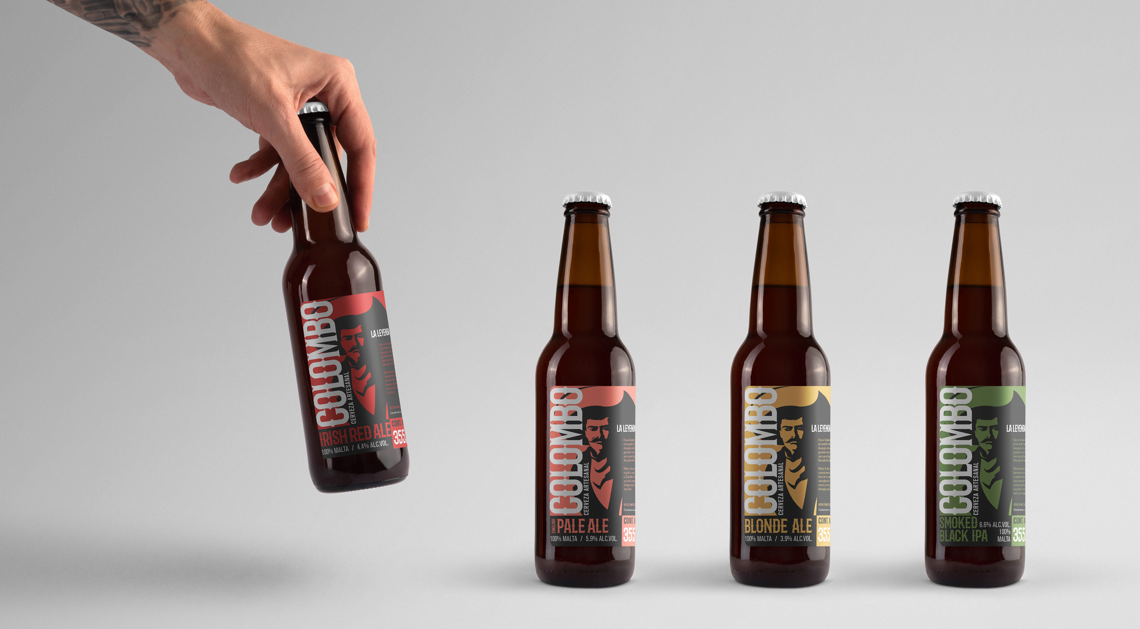
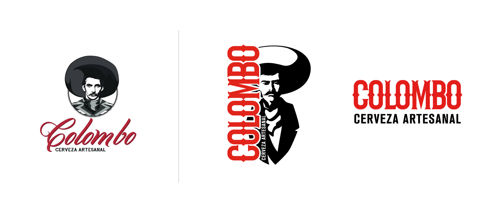
The logo underwent a significant transformation, with a shift from script lettering to a western-inspired font. The abstraction of Colombo as a Spanish character was updated to depict a Mexican rebel from the 1700s. This change reinforced the brand's historical connection and added a touch of rebellion to its image.

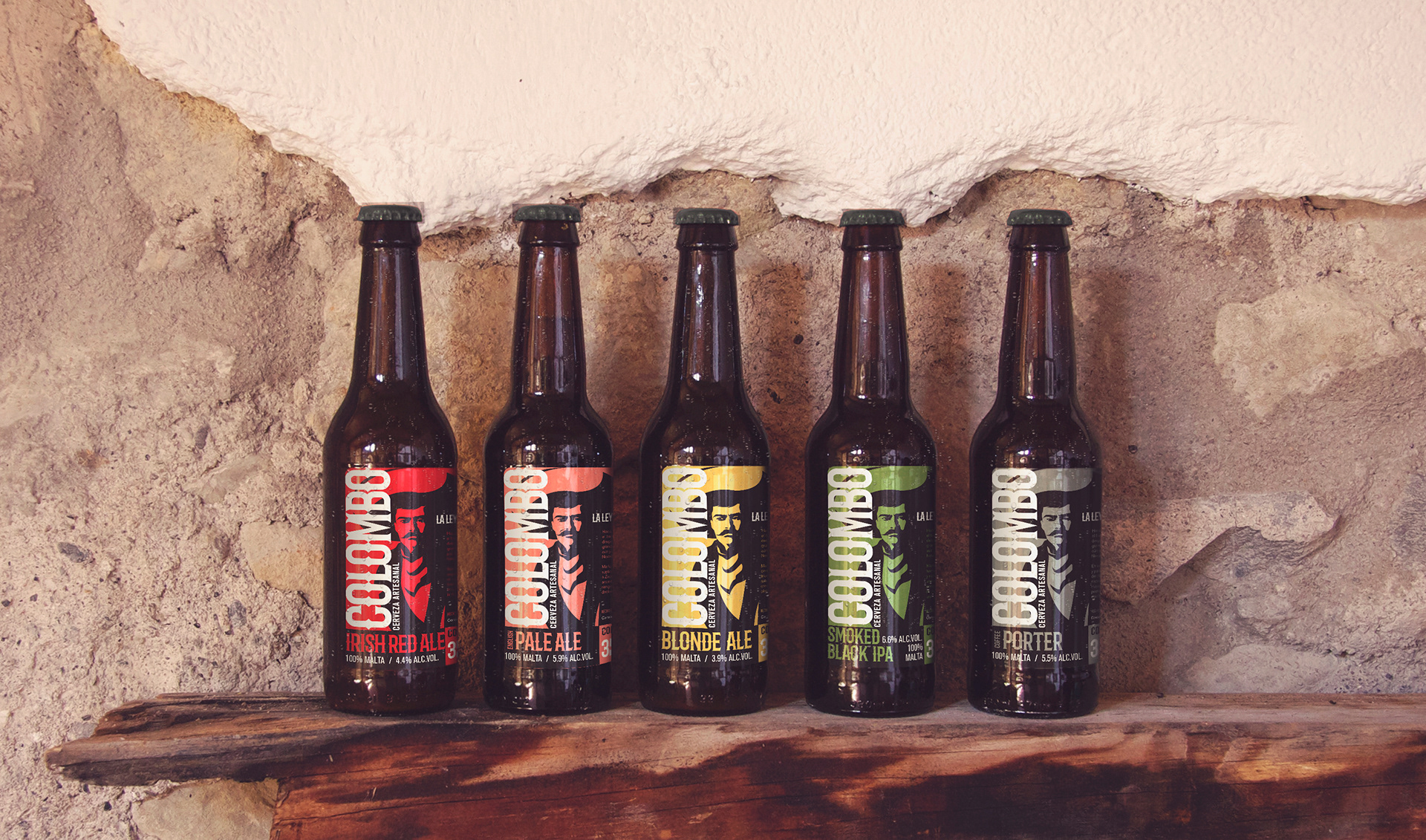
The label design retained the logo as the central element but introduced a twist. Each beer style featured a slightly different expression on Colombo's face, adding an element of intrigue for consumers who paid attention to details. The overall visual style was inspired by old wanted posters, featuring high-contrast stencil-like graphics and western fonts. Dark, earthy colors were used in the color palette, enhancing the brand's rustic appeal.
To ensure the brand stood out on store shelves, the label was designed with a vertical orientation. By placing the logo at the starting point of the label, the design compelled retailers to display the label in a way that showcased 3/4 of the bottle, allowing consumers to catch a glimpse of the beer through the glass. This strategic placement increased visibility and attracted attention in a crowded market.
To ensure the brand stood out on store shelves, the label was designed with a vertical orientation. By placing the logo at the starting point of the label, the design compelled retailers to display the label in a way that showcased 3/4 of the bottle, allowing consumers to catch a glimpse of the beer through the glass. This strategic placement increased visibility and attracted attention in a crowded market.
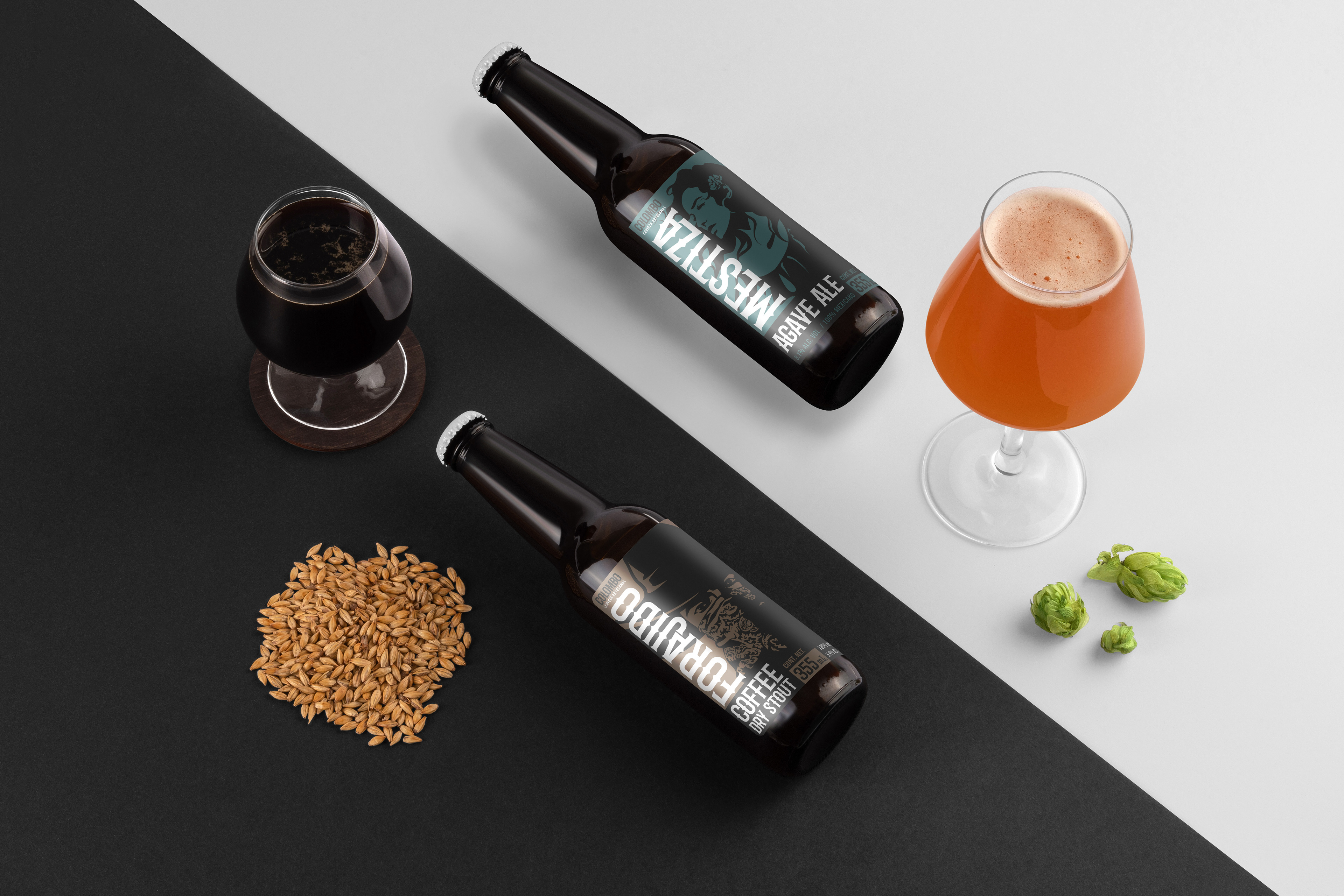
For special edition beers, the same graphic style was employed, but different characters were illustrated to maintain the western theme. The brand also continued to use the western font, which became synonymous with Colombo's identity.
Takeaway
Colombo successfully expanded its audience through rebranding, appealing to craft beer enthusiasts with a historical and rebellious brand. With a visually striking label and tailored elements, Colombo differentiated itself and attracted a wider customer base. The key takeaway: rebranding can expand market reach by creating an appealing identity that communicates values and attracts new customers.