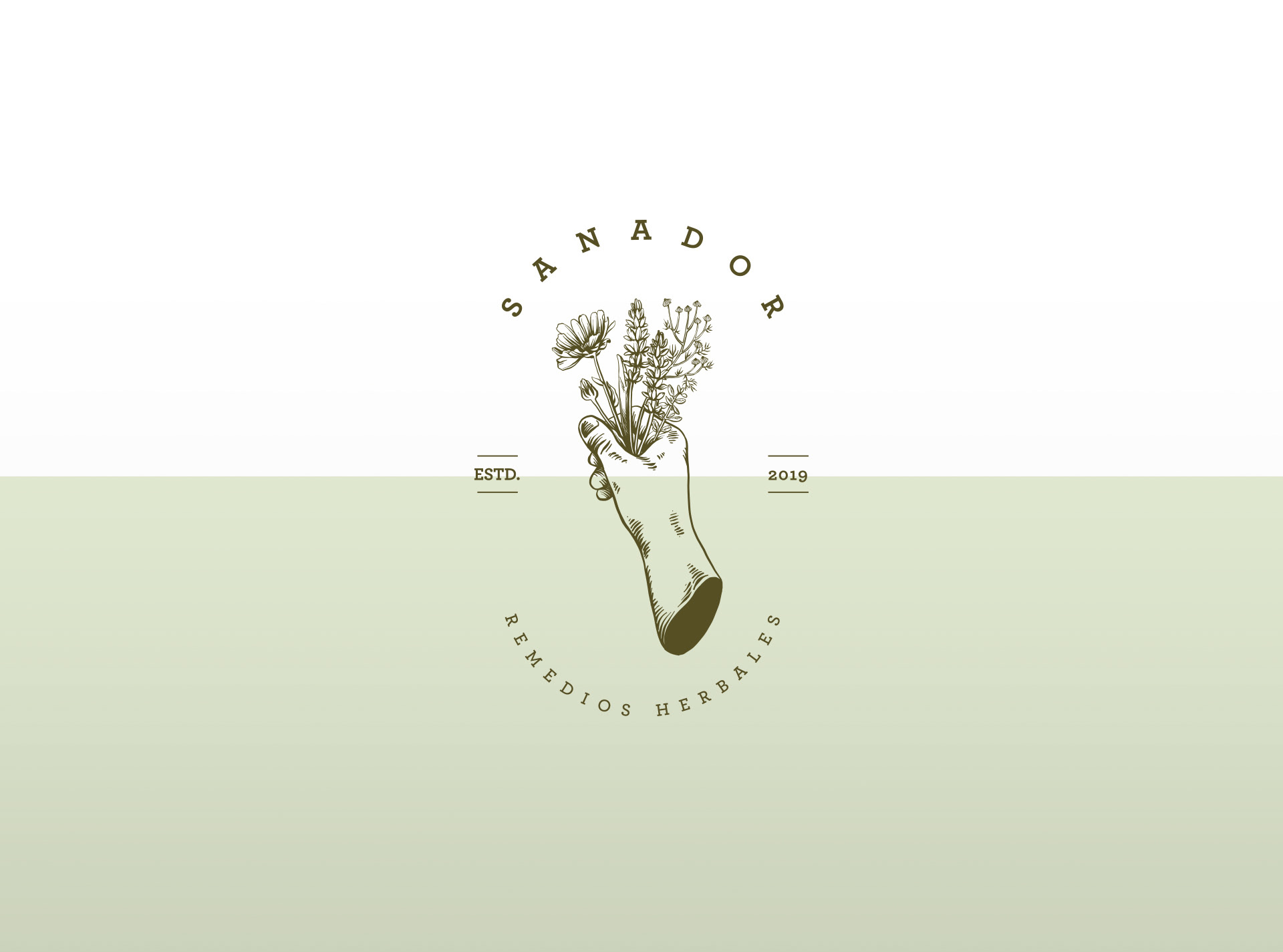
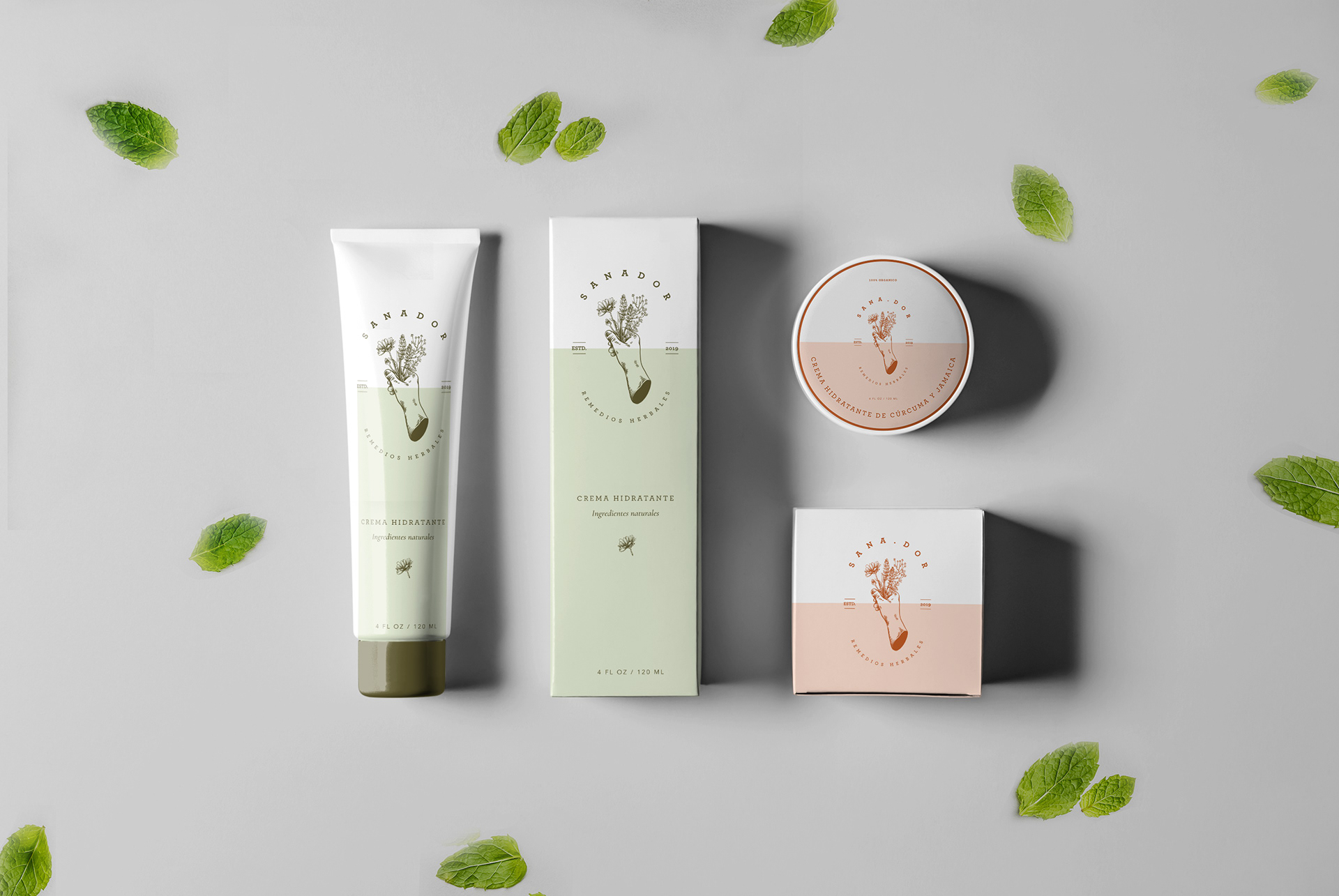
The logo features an (asexual) hand cradling a bunch of medicinal herbs, including lavender, chamomile, thyme, and calendula. This simple yet powerful illustration directly communicates the brand's core offering: herbal remedies for pain relief.
To pay homage to the ancient craft of herbal healing, the logo's design is inspired by 19th-century stamps. This subtle historical reference adds a sense of authenticity and trustworthiness to the brand, reinforcing its commitment to time-tested remedies.
The brand utilizes a Serif typeface to exude elegance and sophistication. The choice of strong and straight Serifs enhances the perception of security and reliability, assuring consumers that they can rely on Sanador Remedios Herbales for effective pain relief.
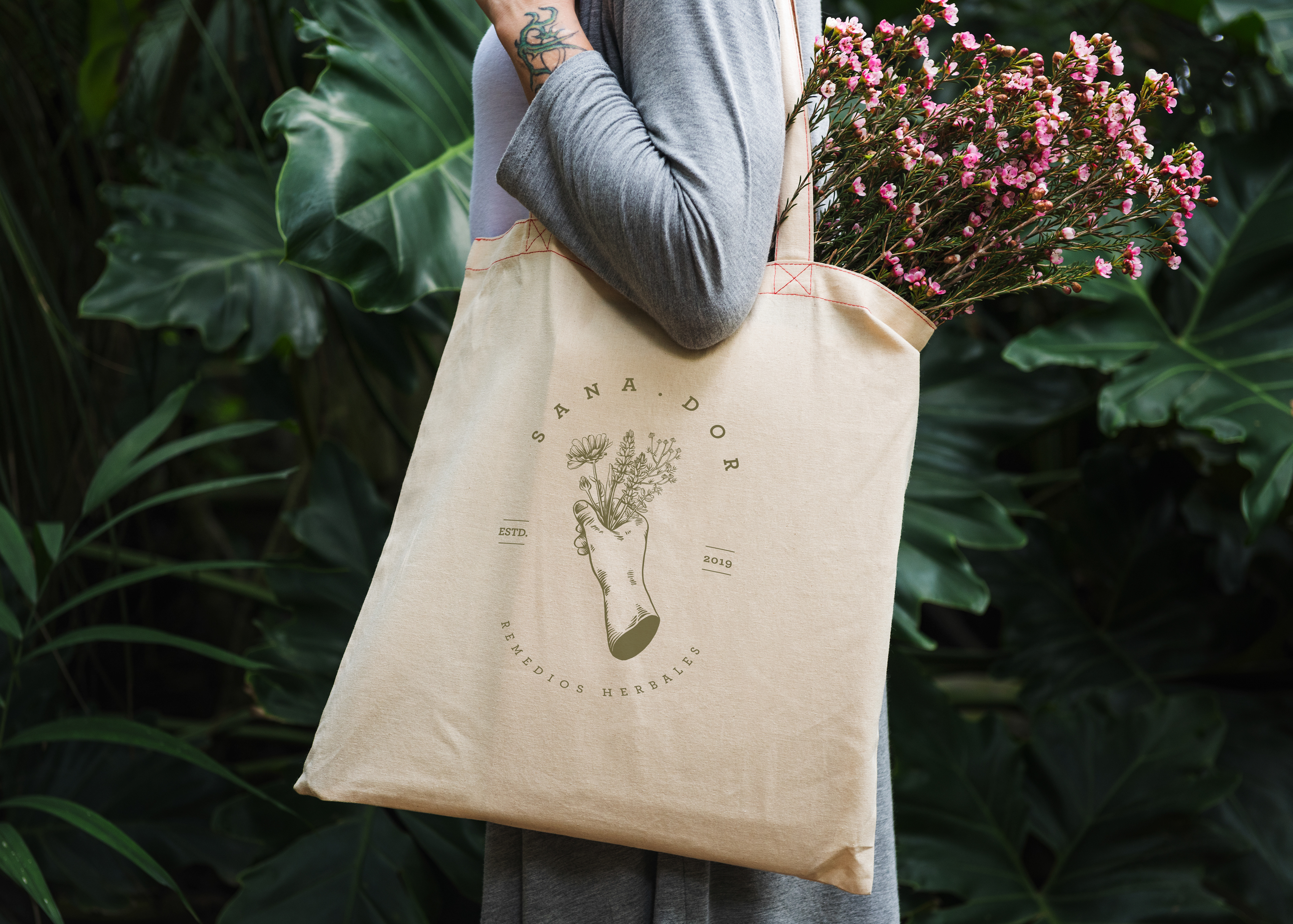
The brand's color palette comprises ocher orange and olive green, both of low saturation, resembling the natural tones of dehydrated herbs. These earthy hues reinforce the brand's connection to nature and the power of natural remedies.
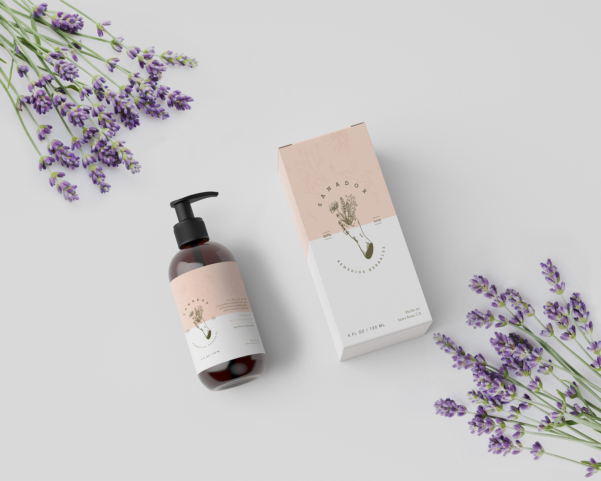
Sanador Remedios Herbales' branding exemplifies the essence of the brand - the harmonious blend of ancient herbal wisdom and modern pain relief solutions. The logo's design, inspired by traditional stamps and featuring an herbal bouquet held by a healing hand, reflects the brand's commitment to herbal remedies and the comforting touch of a skilled healer. The Serif typeface and earthy color palette further enhance the brand's credibility and natural appeal. By evoking a sense of trust, elegance, and tranquility, Sanador establishes itself as a reliable and soothing solution for pain relief through its herbal spray products.