The typographic logo of Maria Machetes serves as a powerful representation of the brand's identity. The emphasis on the word "Machete" pays homage to its popular association with rural Mexican culture, symbolizing the authenticity and boldness of Oaxacan cuisine. The rough cuts in the typography mimic the appearance of a machete's blade, introducing a masculine touch to the design, which intriguingly contradicts the delicate image often associated with the name "Maria."
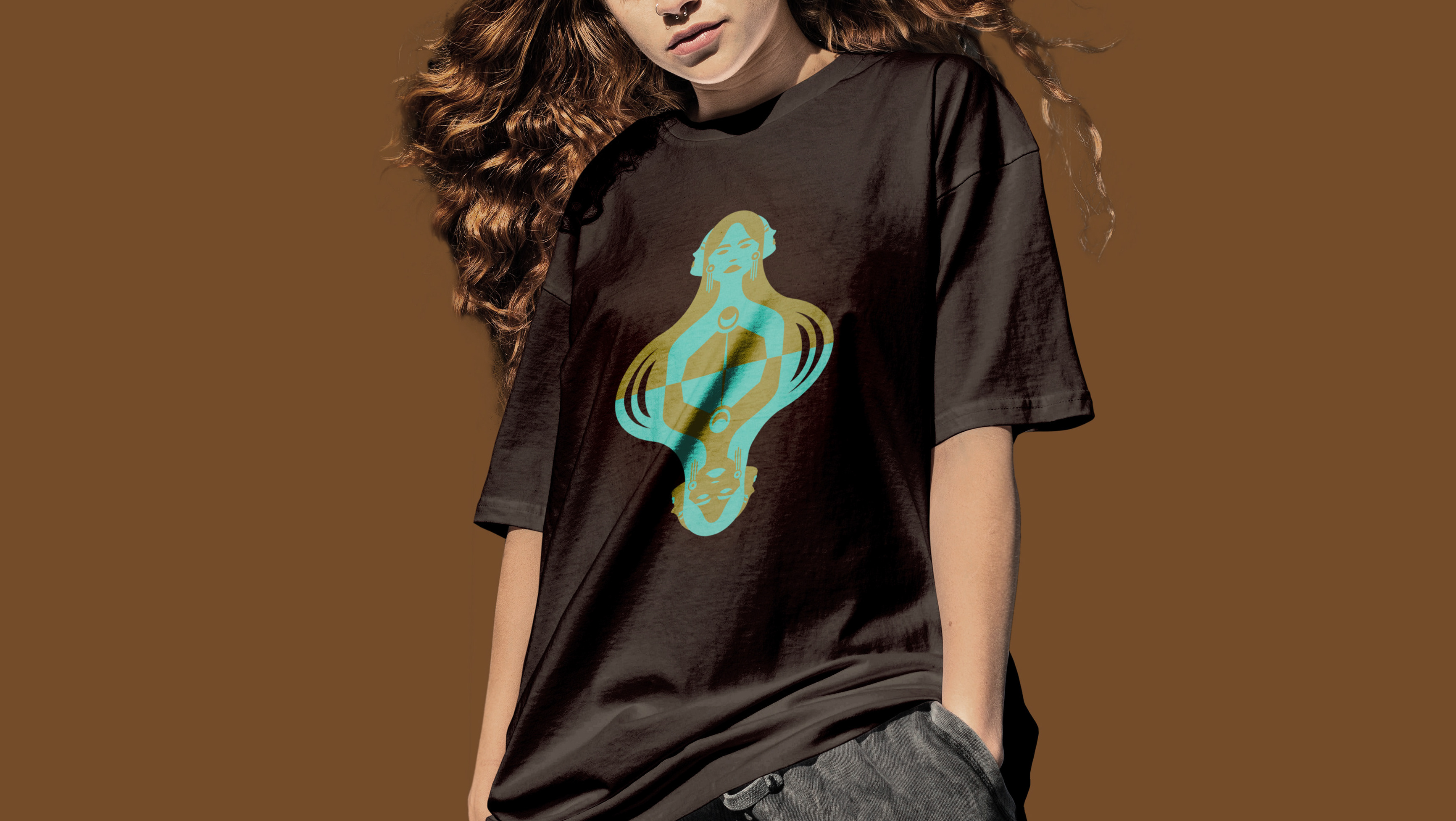
The auxiliary graphic portrays a modern woman with traditional characteristics, seamlessly blending modernity with Mexican culture. This character gracefully slices each ingredient, symbolizing innovation while preserving the richness of tradition. By presenting a strong and empowered female figure, Maria Machetes elevates the role of women in the culinary world, inspiring both locals and tourists to embrace the dynamic fusion of contemporary and traditional flavors.
The color palette chosen for the branding further enhances the essence of Mexican cuisine. The passionate red reflects the intense flavors and emotions present in Mexican food, while the bright yellow captures the heart of Mexican culinary heritage, symbolizing corn and the vibrant energy of the culture.
Maria Machetes, the Oaxacan-style food truck in Sonoma County, embodies the fusion of Mexican heritage and modern feminism. The typographic logo juxtaposes strength with delicacy, while the auxiliary graphic celebrates empowered women in the culinary world. With a passionate color palette reflecting the heart of Mexican cuisine, Maria Machetes delivers a unique and empowering culinary experience.


